Minnesota Opera: Rebrand
2016
Kick, Agency
Stefan Hartung, Creative Director
Jess Simanton, Account Director
Marcie Hill, Copywriter
When Minnesota Opera approached Kick in 2017 for a brand redesign, it was made clear that the new brand should position Minnesota Opera on the national stage as the trailblazer they were.
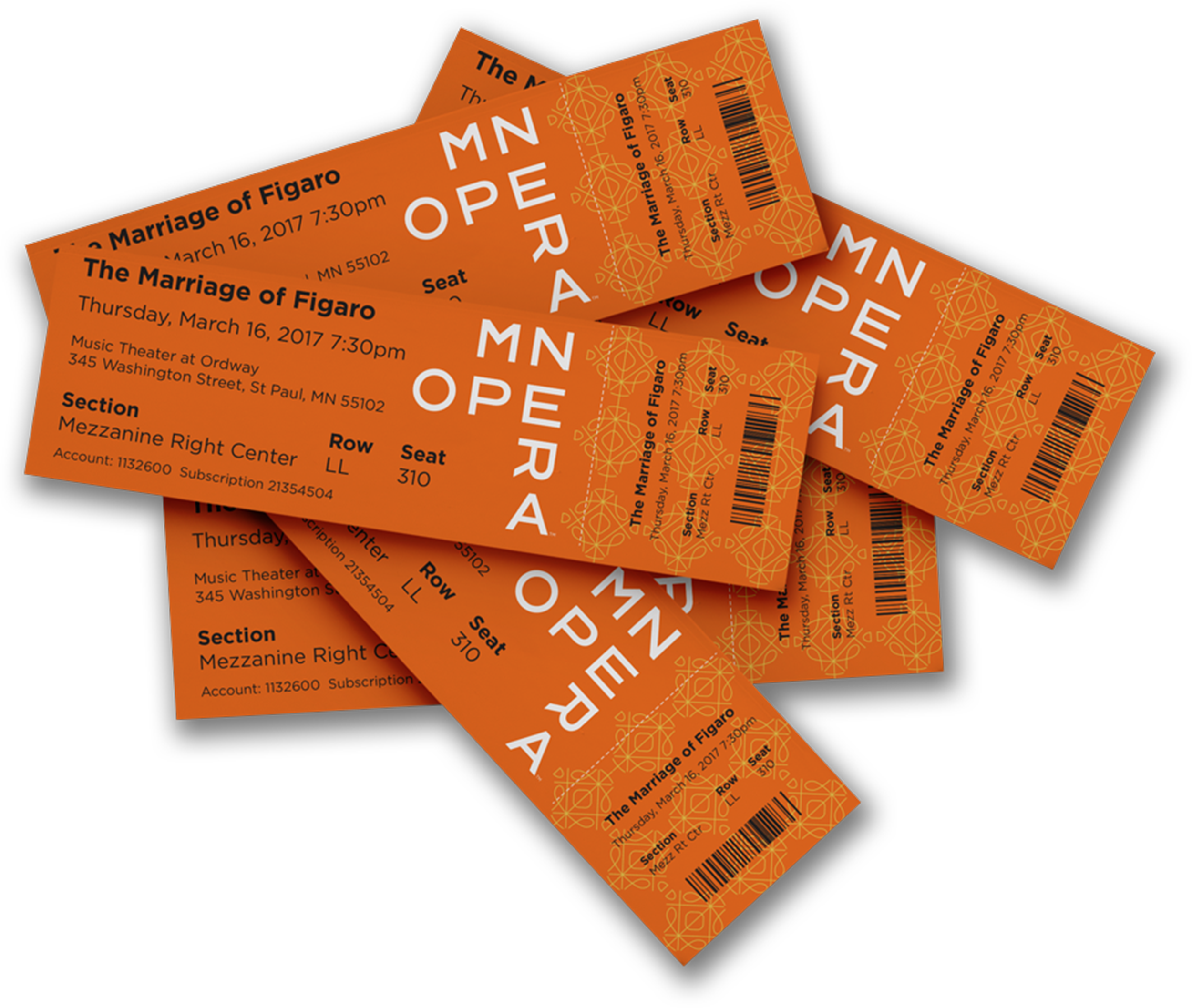
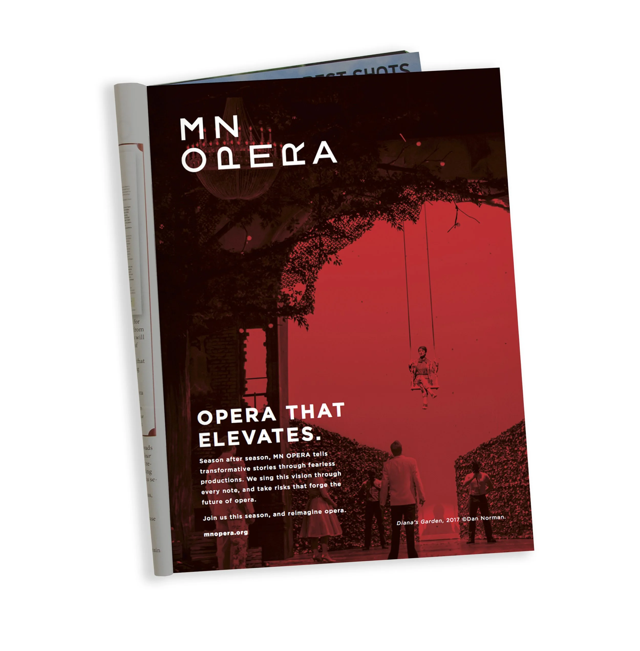
The whole logotype was shortened to the punchier MN OPERA, and the traditional serif typeface was replaced with custom, modified, sans-serif lettering with several lock-up variations.
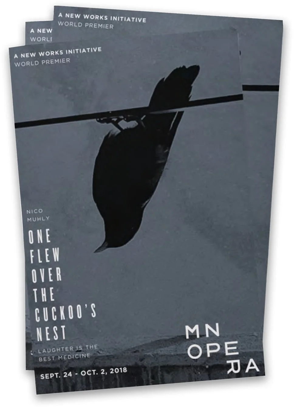
The more readable versions of the logotype would be used for general communications and the more staid opera productions. The more ‘challenging’ lock-ups would be used for boundary-pushing new works and initiatives aimed at younger, more brand-savvy audiences (which Minnesota Opera was also committed to fostering).
For 40 years Minnesota Opera has been highly respected in the national opera community for its initiative in transforming relevant American stories into the operatic format, such as The Shining, The Manchurian Candidate, and Doubt.
Telling Stories.
Taking Risks.
Before
After
Logotype lock-up variations
These three variations are a sample of thirteen that were created for the brand. Everyone seems to have their favorite but the designers at Minnesota Opera were encouraged to explore ways to employ all variations.
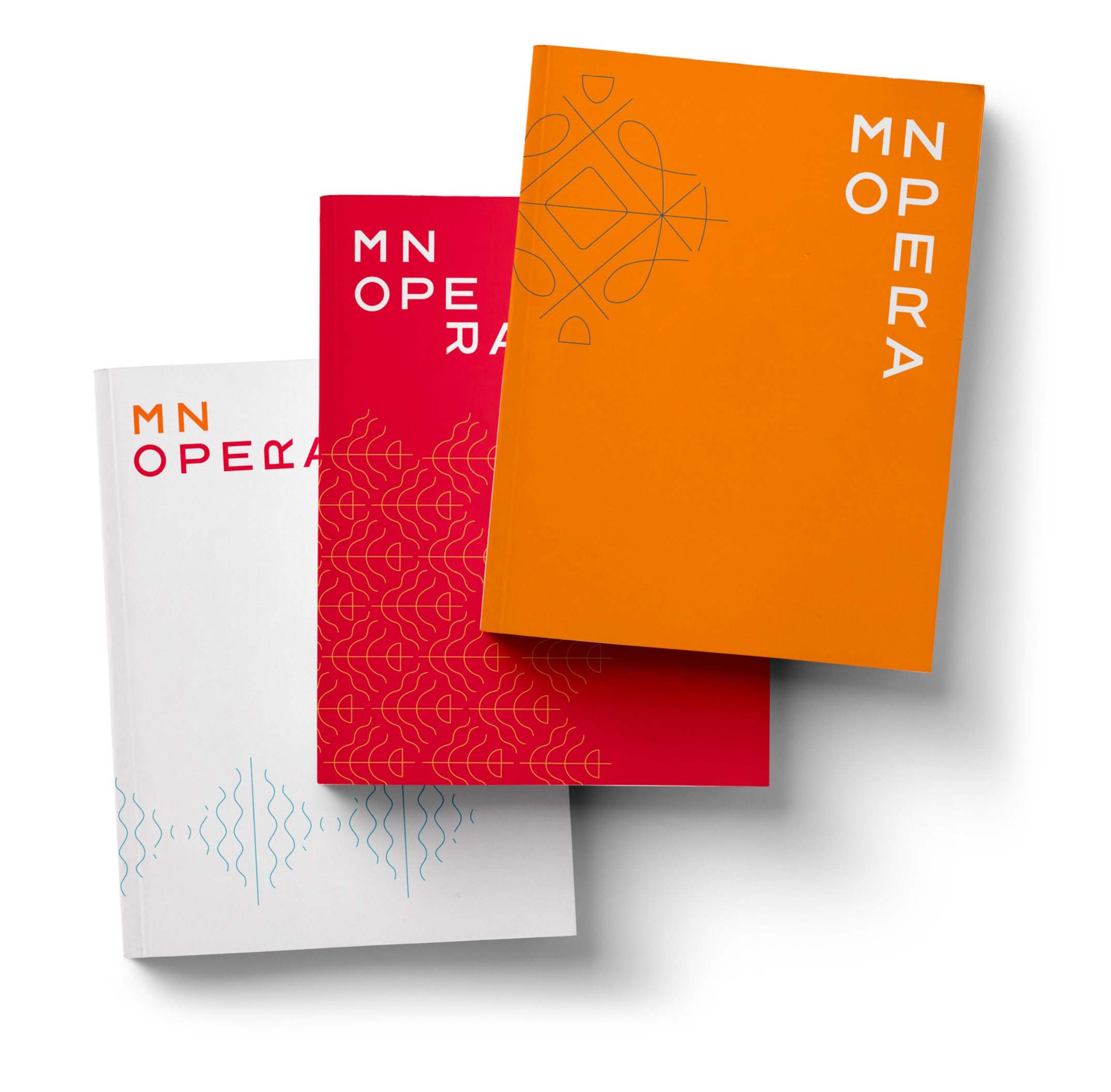
Primary Color Palette
The primary color palette of warm, rich, passionate red and orange are reserved primarily for the logo and Minnesota Opera brand communications and publications. It was understood that individual opera productions would have their own unique design assets. With this in mind the brand color palette was kept small and concise.

Opera Red

Opera Orange
Accent Color Palette
A small number of accent colors were chosen for a secondary palette. These colors are to be used with the accent figures (shown below). They are not to be used in large areas and should always be secondary to the primary palette.

Daybreak

Nightfall

Text Gray

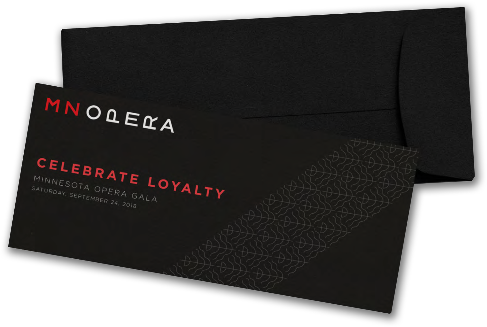
VIP Black
Ocean

Text Gray and VIP Black
An 80% gray was chosen for all text in Minnesota Opera communications. This use of gray is slightly easier on the eyes and conveys a level of sophistication associated with the opera.
100% black is reserved for use only in communications to prominent patrons and donors and special events such as the annual gala.
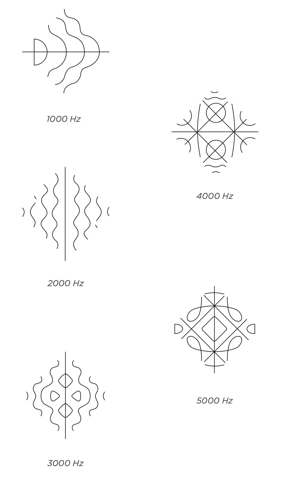
Accent Figures
Additional textural and pattern elements known as Chladni figures were included with the rebrand. The designs of these figures reflect the patterns and shapes created by exposing a sand covered sheet of steel to various acoustic tones. These patterns are the literal visualization of acoustic energy, the foundation of song and music.
The rules regarding the use of these accent figures are minimal. The one cardinal rule is that they must not be rotated.
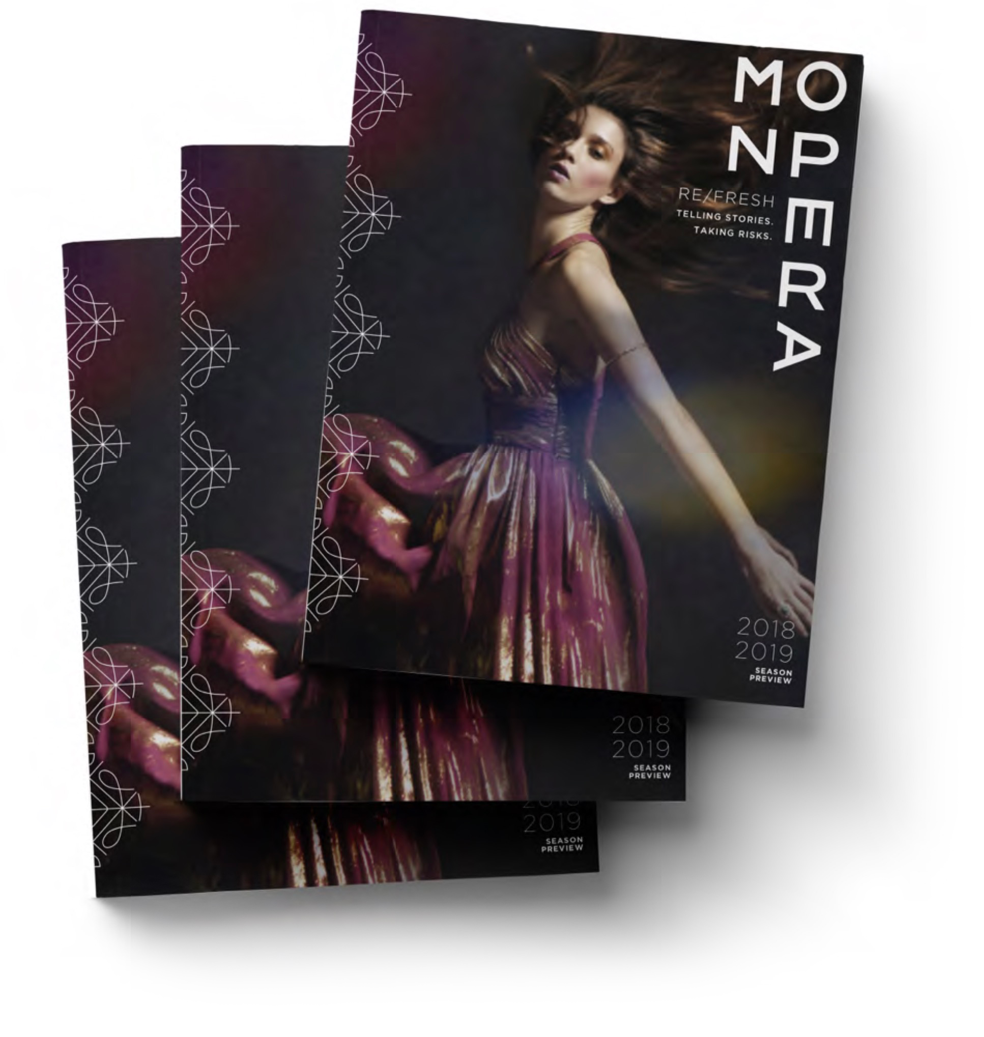
Sample Applications
A necessary step in any brand design is ‘pressure testing’ the brand and its components in multiple applications, seeing where it succeeds and where its deficient. This iterative process is also helpful in conveying the visual concept to the client or those responsible for implementing the brand and for generating excitement.
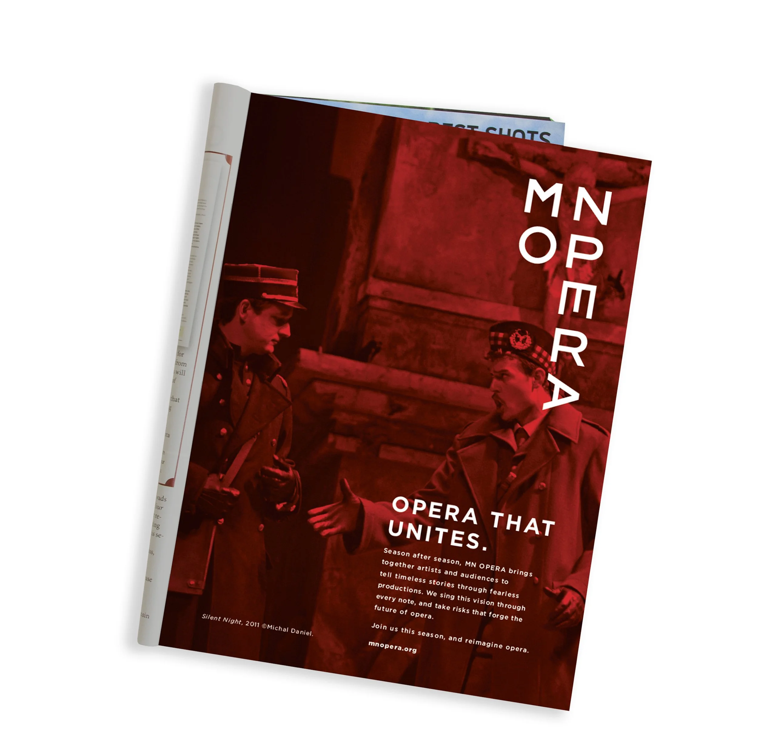
Launch Ads
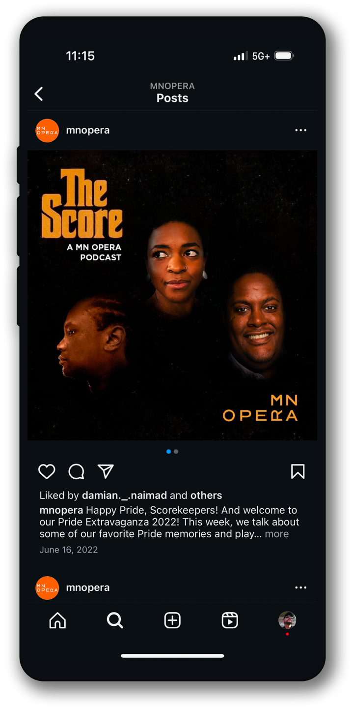
Coda
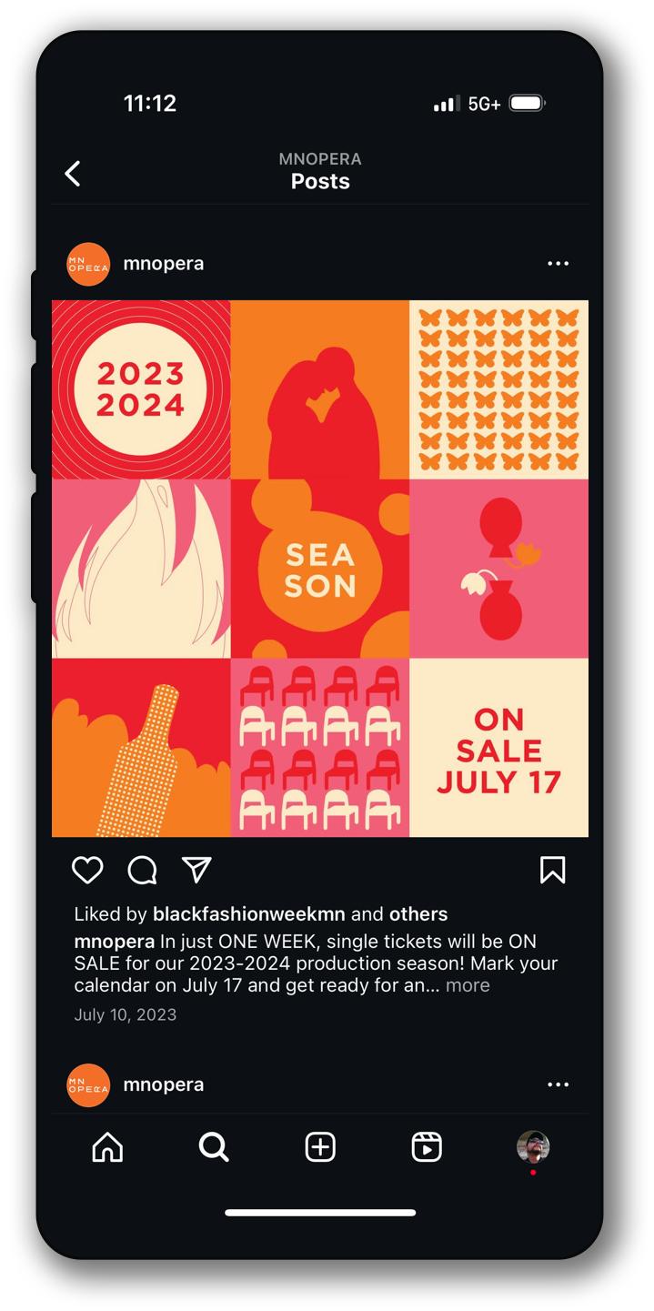
It’s been almost ten years since Minnesota Opera adopted its new brand. Since then it’s proven to be durable and flexible. A quick scroll through their Instagram feed (the most timely display of just about any organization’s branding) shows that Minnesota Opera stayed true to its commitment to telling stories and taking risks. Additionally they’ve committed to thoughtfully showcasing and growing their brand while staying true to the original concept.