Blue Cross Blue Shield of Minnesota: Visual System
2006
Larsen, Agency
David Garcia, Creative Director
John Schneider, Account Director
John Andreini, Copywriter

Tell Me Where it Hurts.
In 2006 the situation Blue Cross Blue Shield’s internal design and communications team was dealing with was one of limited brand guidelines and assets. This meant the team had to start practically from scratch for every project, and it contributed to an inconsistent representation of the BCBS brand.
As the agency charged with the redesign, Larsen needed to create a robust visual system that was effective and efficient across numerous communications, and a set of easy to use templates, all without conflicting with the BCBS corporate brand. Then package it all up into a website where designers and brand employees could easily download the assets they needed (kind of a novel idea in 2006).
It was incredibly important to Larsen to bring the internal BCBS design team into the redesign process early to understand exactly what their needs were, and to make sure we would be delivering templates and assets that were truly useful to them. These meetings also fostered a sense camaraderie between the two teams who became each others best advocates throughout the process.
“We Don’t Have a Logo. We have a Sentence.”
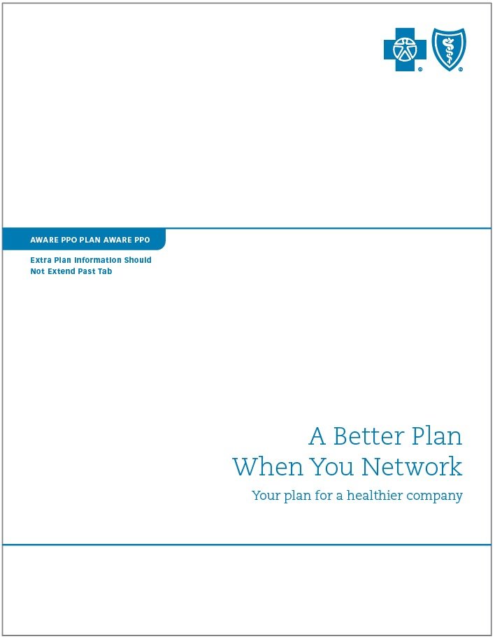
One of the initial challenges the Larsen team heard was that the full BCBS Minnesota logo was difficult to use. The number of characters and the physical length of the full logo meant it was often relegated to a small size in the corner of the layout.
Backed with BCBS’s own corporate study which indicated that the blue cross and shield in their logo was one of the most recognized logos in America (after Visa and Mastercard) we proposed reserving the full logo for the back of all communications and using only the blue cross and shield on the front at an increased size. Somewhat surprisingly, BCBS Minnesota’s legal department and BCBS corporate both signed off on the idea.
One of the BCBS designers confided to me that if this was the only battle we won in the whole redesign process he would be happy.
“We’re Not an Airport.”
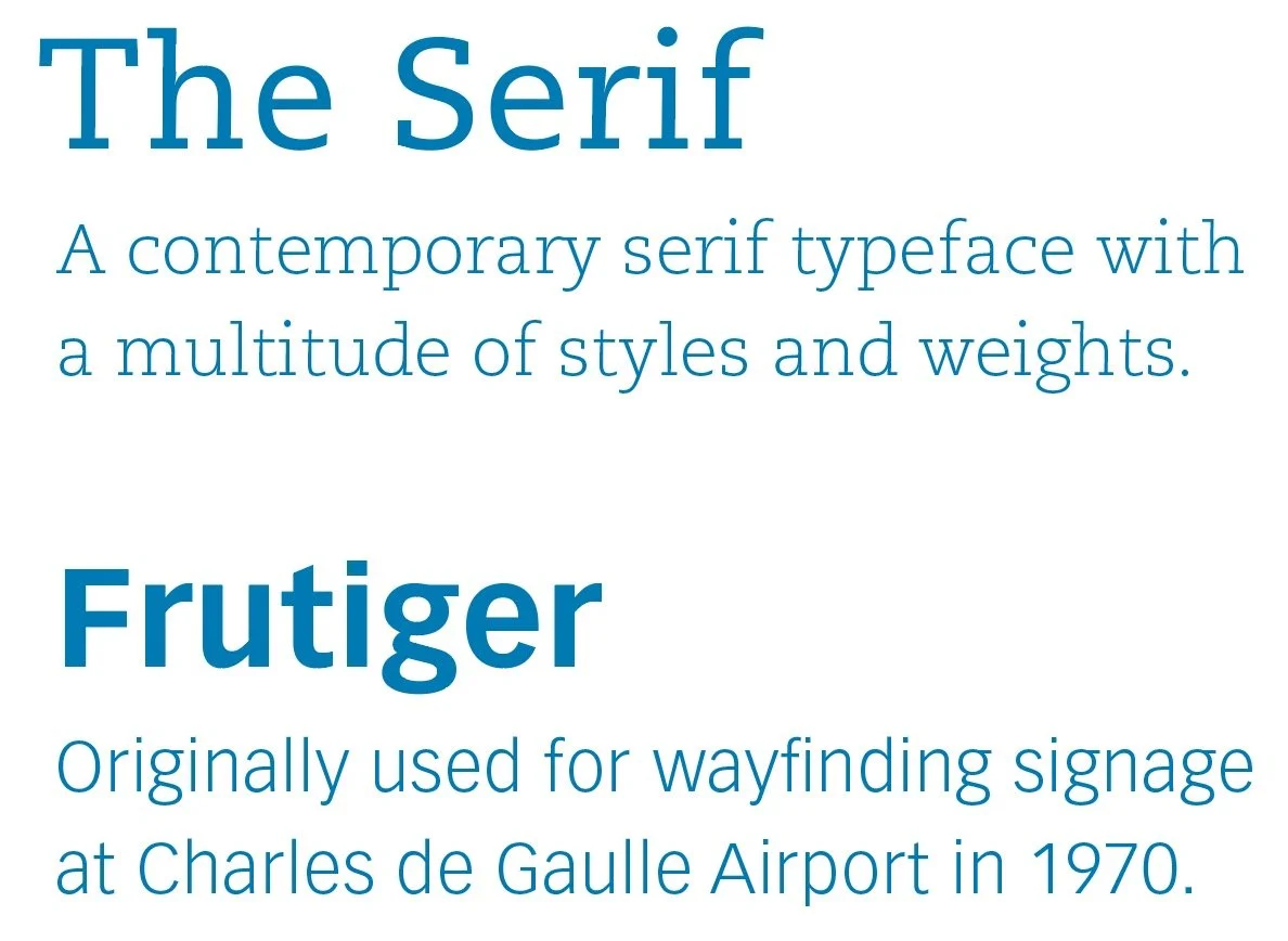
Next on the list of pain points was the existing brand guideline that the only typeface available for use to the BCBS design team was Frutiger. While popular for institutional signage the BCBS team felt it was overly restrictive and that they really needed a contrasting typeface that was more contemporary, a bit more expressive, and a lot more flexible to use.
We brought The Serif typeface into the visual system with its tasteful and modern serifs and multitude of styles and weights. The Serif was used for both headlines and body copy while Frutiger was reserved for text of smaller sizes as well as tables and charts.
“Our Blue is … Not Great.”
BCBS’s corporate blue is PMS 3015. The internal BCBS team was not fond of using it because it was too dark and heavy when used in large areas and it was difficult to reproduce in four-color process with their vendors. To top it off, there were no other ‘approved’ colors for use within the visual system. This lead to the wildly inconsistent application of color across communications.
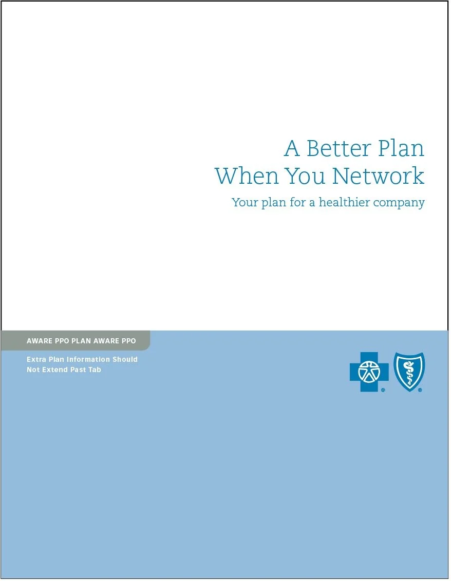
The solution the Larsen team arrived at was to first reserve PMS 3015 strictly for the logo. This would reinforce PMS 3015 as the ‘brand’ blue, and prevent it from being diluted through overuse.

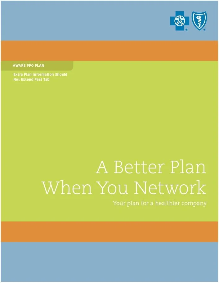
Next we developed a palette of six blues of differing values and hues, which became the new primary palette. This shifted brand efforts away from owning a single (problematic) blue and towards owning blue as a category of colors.


Additionally, the extended architecture of the BCBS Minnesota brand required an expanded number of secondary colors. After launch some products and departments began to request specific and exclusive claims to individual colors within the secondary palette. Everyone has their favorite combination.


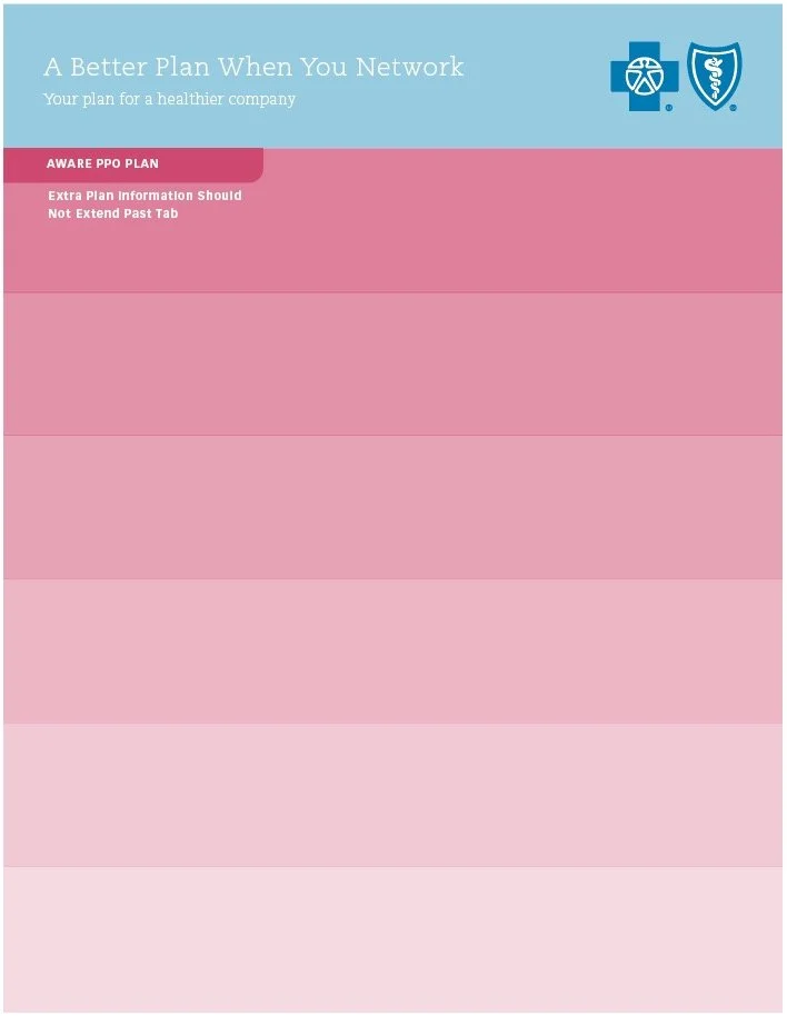
“A Grid! Finally!”
Templated layout grids aren’t something designers often get excited about, but the BCBS team was hungry for anything that made their lives easier. Larsen developed a flexible system based around a grid that always divided the page into fourteen horizontal sections. This meant a consistent grid could be applied to any communication piece regardless of size or aspect ratio. The final suite of templates also included vertical grid lines, margin allowances and an additional colored tab for specific products and plans.


“Beautiful. Does It Work?”
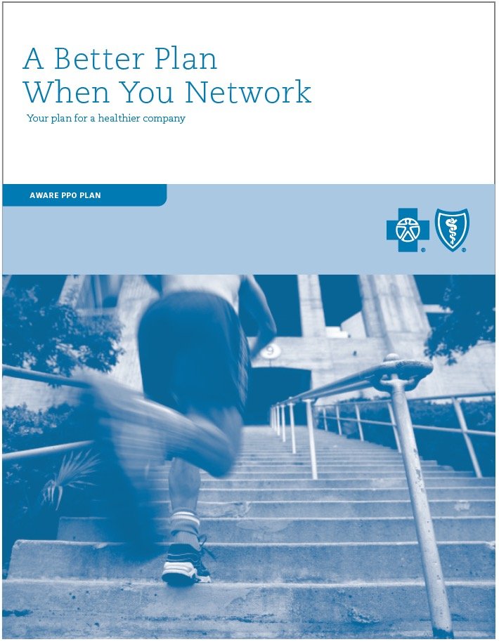
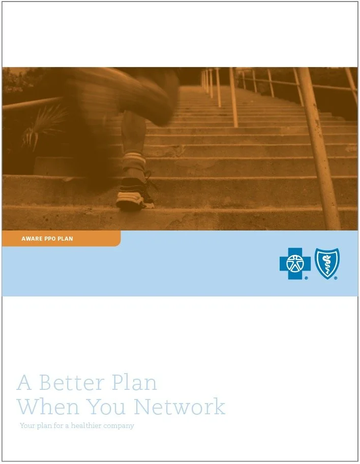
In order to pressure test the system and show the BCBS team how flexible and durable it was I created 16 separate covers with varying colors and photography. It was convincing and exciting for the BCBS team to see the possibilities that were now open to them. Additionally, Larsen created a flash animation to launch the new visual system at a BCBS conference, but it’s been lost somewhere in a stack of my old hard drives.


Proof of Concept
Before handing off the completed templates to BCBS the Larsen team created a brochure for the Options Blue product plan utilizing all the new templates and assets.

The Website
Once the visual system was final and all assets had been developed Larsen created a website containing all of the new visual system guidelines and downloadable assets, as well as additional brand attributes. This was a pretty novel idea in 2006, even though it’s commonplace today. The site also utilized custom permissions for users with varying degrees of access to information and assets. And yes, that is Safari from 2006.
